Estimation of the probability density function using score matching
Optimization
Score Matching
Julia
Score matching is a method for indirectly estimating the probability density function of a distribution. In this post, I will explain the score matching method as well as some of its limitations.
Author
Simon Ghyselincks
Published
June 22, 2024
The Problem of Density Estimation
When working with a set of data, one of the tasks that we often want to do is to estimate the underlying probability density function (PDF) of the data. Knowing the probability distribution is a powerful tool that allows to make predictions, generate new samples, and understand the data better. For example, we may have a coin and want to know the probability of getting heads or tails. We can flip the coin many times and count the number of heads and tails to estimate the probability of each outcome. However, when it comes to higher dimensional spaces that are continuous in distribution, the problem of estimating the PDF in this way becomes intractable.
For example, with a set of small images such as the CIFAR-10 dataset, the images are 32x32 pixels with 3 color channels. The number of dimensions in the data space is 32x32x3 = 3072. With 8-bit images the number of all possible unique images is \(255^{3072}\), which is an incomprehensibly large number. The 60,000 images that are included in CIFAR-10 represent but a tiny fraction of samples in the space of all possible images.
Figure 1: Sample images from the CIFAR-10 dataset(Krizhevsky 2009)
To demonstrate the issue with random image generation in such a sparsely populated space, we can generate a random 32x32 image with 3 color channels and display it.
Show the code
usingPlots, Images# Generate 6 random images and display them in a gridplots = []for i in1:6# Generate a random 32x32 3-channel imageim=rand(3, 32, 32)im=colorview(RGB, im) p =plot(im, showaxis=false, showgrid=false, title="Random Image $i")push!(plots, p)end# Create a plot with a 2x3 grid layoutplot_grid =plot(plots..., layout=(2, 3), size=(800, 400))
Yes we have successfuly generated random 32x32 color images, but they are not very useful or interesting.
If there were some way to learn the underlying distribution of the data, we could generate new samples that are realistic (probable) but that have never been seen before by sampling from higher probability regions of the learned distribution. So how do recent developments in machine learning manage to generate new and plausible samples from high dimensional data sets?
One of the techniques that has been developed is called generative modeling. Generative models are a class of machine learning models that are trained to learn the underlying distribution of the data. Once the model has learned the distribution, it can generate new samples that are similar to the training data.
One of the powerful techniques that allows for learning a probability distribution is score matching.
Parameter Estimation
Let us take a moment to consider the problem of fitting a model to data in the most simple sense. Suppose that we have a set of data points and want to fit a linear model by drawing a line through it. One of the techniques that can be used is to minimize the sum of the squared errors between the data points and the line. This is known as the method of least squares.
We have model \(f(x) = \hat y = mx + b\) with free parameters \(\theta = {m, b}\) and data points \((x_i, y_i)\). The objective is to find the parameters \(\theta\) that minimize the sum of the squared errors \(J\) between the predicted values \(\hat y_i\) and the true values \(y_i\).: \[ \text{arg}\min_{m,b} J(m,b) = \text{arg}\min_{m,b} \sum_{i=1}^{n} (\hat y_i - y_i)^2 \]
We could use some calculus at this point to solve the minimization problem but more general matrix methods can be used to solve the problem.
The solution to this problem is well known and can be found by solving the normal equations: \[ X^T X \vec{\theta} = X^T \vec{y} \]
An example of this optimization problem is shown below where we generate some random data points and fit a line to them.
Show the code
usingPlots, Random# Generate some random data points with correlation along a lineRandom.seed!(1234)n_points =10x =rand(n_points)m_true =0.8; b_true =-1y =.8* x .-1+0.3*randn(n_points)# Create the matrix XX =hcat(ones(n_points), x)# Solve the normal equations to find the parameters thetatheta = X \ y# Generate x values for the complete linex_line =range(minimum(x) -0.1, maximum(x) +0.1, length=100)X_line =hcat(ones(length(x_line)), x_line)# Compute the y values for the liney_hat_line = X_line * theta# Compute the fitted values for the original data pointsy_hat = X * theta# Unpack learned parametersb, m = theta# Plot the data points and the fitted linetitle_text ="Fitted Line: y = $(round(m, digits=2))x + $(round(b, digits=2)) vs. \n True Line: y = $(m_true)x + $(b_true)"p1 =scatter(x, y, label="Data Points", color=:red, ms=5, aspect_ratio=:equal, xlabel="x", ylabel="y", title=title_text)plot!(p1, x_line, y_hat_line, label="Fitted Line", color=:blue)# Add dashed lines for residualsfor i in1:n_pointsplot!(p1, [x[i], x[i]], [y[i], y_hat[i]], color=:black, linestyle=:dash, label="")enddisplay(p1)
This is a simple example of parameter estimation but it shows some of the important concepts that are used in more complex models. There is an underlying distribution which is a line with some error or noise added to it. We collected some random points from the distribution and then used them in an optimization problem where we minimized the squared error between the predicted values and the true values. The best solution is the parameters \(\theta\) that minimize the error. In doing so we recovered a line that is close to the one that was used to generate the data.
Estimating a Density Function
When it comes to estimating denstity we are constrained by the fact that any model must sum to 1 of the entire sample space.
Denoising Autoencoders
Denoising Autoencoders (DAE) are a type of machine learning model that is trained to reconstruct the input data from a noisy or corrupted version of the input. The DAE is trained to take an sample such as an image with unwanted noise and restore it to the original sample.
In the process of learning the denoising parameters, the DAE also can learn the score function the underlying distribution of noisy samples, which is a kernel density estimate of the true distribution.
The score function is an operator defined as: \[ s(f(x)) = \nabla_x \log f(x) \]
Where \(f(x)\) is the density function or PDF of the distribution.
By learning a score function for a model, we can reverse the score operation to obtain the original density function it was derived from. This is the idea behind score matching, where we indirectly find the the pdf of a distribution by matching the score of a proposed model \(p(x;\theta)\) to the score of the true distribution \(q(x)\).
Another benefit of learning the score function of a distribution is that it can be used to move from less probable regions of the distribution to more probable regions using gradient ascent. This is useful when it comes to generative models, where we want to generate new samples from the distribution that are more probable.
However one of the challenges is that the score function is not always well-defined, especially in regions of low probability where there are sparse samples. This can make it difficult to learn the score function accurately in these regions.
This post explores some of those limitations and how increasing the bandwidth of the noise kernel in the DAE can help to stabilize the score function in regions of low probability.
Sample of Score Matching
Suppose we have a distribution in 2D space that consists of three Gaussians as our ground truth. We can plot this pdf and its gradient field.
Show the code
usingPlots, Distributions# Define the ground truth distributionfunctionp(x, y) mu1, mu2, mu3 = [-1, -1], [1, 1], [1, -1] sigma1, sigma2, sigma3 = [0.50.3; 0.30.5], [0.50.3; 0.30.5], [0.50; 00.5]return0.2*pdf(MvNormal(mu1, sigma1), [x, y]) +0.2*pdf(MvNormal(mu2, sigma2), [x, y]) +0.6*pdf(MvNormal(mu3, sigma3), [x, y])end# Plot the distribution using a heatmapheatmap(-3:0.01:3, -3:0.01:3, p, c=cgrad(:davos, rev=true), aspect_ratio=:equal, xlabel="x", ylabel="y", title="Ground Truth PDF q(x)", xlims=(-3, 3), ylims=(-3, 3), xticks=[-3, 3], yticks=[-3, 3])
Sampling from the distribution can be done by generating 100 random points
Show the code
usingRandom, Plots, Distributions# Define the ground truth distributionfunctionp(x, y) mu1, mu2, mu3 = [-1, -1], [1, 1], [1, -1] sigma1, sigma2, sigma3 = [0.50.3; 0.30.5], [0.50.3; 0.30.5], [0.50; 00.5]return0.2*pdf(MvNormal(mu1, sigma1), [x, y]) +0.2*pdf(MvNormal(mu2, sigma2), [x, y]) +0.6*pdf(MvNormal(mu3, sigma3), [x, y])end# Sample 200 points from the ground truth distributionn_points =200points = []# Set random seed for reproducibilityRandom.seed!(1234)whilelength(points) < n_points x =rand() *6-3 y =rand() *6-3ifrand() <p(x, y)push!(points, (x, y))endend# Plot the distribution using a heatmap# heatmap(# -3:0.01:3, -3:0.01:3, p,# c=cgrad(:davos, rev=true),# aspect_ratio=:equal,# xlabel="x", ylabel="y", title="Ground Truth PDF q(θ)",# )# Scatter plot of the sampled pointsscatter([x for (x, y) in points], [y for (x, y) in points], label="Sampled Points", color=:red, ms=2, xlims=(-3, 3), ylims=(-3, 3), xticks=[-3, 3], yticks=[-3, 3])
From this sampling of points we can visualize the effect of the choice of noise bandwidth on the kernel density estimate.
Show the code
usingPlots, Distributions, ForwardDiff# Define the ground truth distributionfunctionp(x, y) mu1, mu2, mu3 = [-1, -1], [1, 1], [1, -1] sigma1, sigma2, sigma3 = [0.50.3; 0.30.5], [0.50.3; 0.30.5], [0.50; 00.5]return0.2*pdf(MvNormal(mu1, sigma1), [x, y]) +0.2*pdf(MvNormal(mu2, sigma2), [x, y]) +0.6*pdf(MvNormal(mu3, sigma3), [x, y])end# Define the log of the distributionfunctionlog_p(x, y) val =p(x, y)return val >0 ? log(val) :-Infend# Function to compute the gradient using ForwardDifffunctiongradient_log_p(u, v) grad = ForwardDiff.gradient(x ->log_p(x[1], x[2]), [u, v])return grad[1], grad[2]end# Generate a grid of pointsxs =-3:0.5:3ys =-3:0.5:3# Create meshgrid manuallyxxs = [x for x in xs, y in ys]yys = [y for x in xs, y in ys]# Compute the gradients at each pointU = []V = []for x in xsfor y in ys u, v =gradient_log_p(x, y)push!(U, u)push!(V, v)endend# Convert U and V to arraysU =reshape(U, length(xs), length(ys))V =reshape(V, length(xs), length(ys))# Plot the distribution using a heatmapheatmap(-3:0.01:3, -3:0.01:3, p, c=cgrad(:davos, rev=true), aspect_ratio=:equal, xlabel="x", ylabel="y", title="Ground Truth PDF q(x) with score", xlims=(-3, 3), ylims=(-3, 3), xticks=[-3, 3], yticks=[-3, 3])# Flatten the gradients and positions for quiver plotxxs_flat = [x for x in xs for y in ys]yys_flat = [y for x in xs for y in ys]# Plot the vector fieldquiver!(xxs_flat, yys_flat, quiver=(vec(U)/20, vec(V)/20), color=:green, quiverkeyscale=0.5)
Now we apply a Gaussian kernel to the sample points to create the kernel density estimate:
Show the code
usingPlots, Distributions, KernelDensity# Convert points to x and y vectorsx_points = [x for (x, y) in points]y_points = [y for (x, y) in points]# Perform kernel density estimation using KernelDensity.jlparzen =kde((y_points, x_points); boundary=((-3,3),(-3,3)), bandwidth = (.3,.3))# Plot the ground truth PDFp1 =heatmap(-3:0.01:3, -3:0.01:3, p, c=cgrad(:davos, rev=true), aspect_ratio=:equal, xlabel="x", ylabel="y", title="Ground Truth PDF q(x)", xlims=(-3, 3), ylims=(-3, 3), xticks=[-3, 3], yticks=[-3, 3])# Scatter plot of the sampled points on top of the ground truth PDFscatter!(p1, x_points, y_points, label="Sampled Points", color=:red, ms=2)# Plot the kernel density estimatep2 =heatmap( parzen.x, parzen.y, parzen.density, c=cgrad(:davos, rev=true), aspect_ratio=:equal, xlabel="x", ylabel="y", title="Kernel Density Estimate", xlims=(-3, 3), ylims=(-3, 3), xticks=[-3, 3], yticks=[-3, 3])# Scatter plot of the sampled points on top of the kernel density estimatescatter!(p2, x_points, y_points, label="Sampled Points", color=:red, ms=2)# Arrange the plots side by sideplot(p1, p2, layout =@layout([a b]), size=(800, 400))
Now looking at the density estimate across many bandwidths, we can see the effect on adding more and more noise to the original sampled points and our density estimate that we are learning. At very large bandwidths the estimate becomes a uniform distribution.
Show the code
usingPlots, Distributions, KernelDensity# Define the range of bandwidths for the animationbandwidths = [(0.01+0.05* i, 0.01+0.05* i) for i in0:40]# Create the animationanim =@animatefor bw in bandwidths kde_result =kde((x_points,y_points); boundary=((-6, 6), (-6, 6)), bandwidth=bw) p2 =heatmap( kde_result.x, kde_result.y, kde_result.density', c=cgrad(:davos, rev=true), aspect_ratio=:equal, xlabel="x", ylabel="y", title="Kernel Density Estimate,Bandwidth = $(round(bw[1],digits=2))", xlims=(-6, 6), ylims=(-6, 6), xticks=[-6, 6], yticks=[-6, 6] )scatter!(p2, x_points, y_points, label="Sampled Points", color=:red, ms=2)end# Save the animation as a GIFgif(anim, "parzen_density_animation_with_gradients.gif", fps=2,show_msg =false)
Now we can compute the score of the kernel density estimate to see how it changes with the bandwidth. The score function of the distribution is numerically unstable at regions of sparse data. Recalling that the score is the gradient of the log-density funtion, when the density is very low the function approaches negative infinity. Within the limits of numerical precision, taking the log of the density function will result in a negative infinity in sparse and low probability regions. Higher bandwidths of KDE using the Gaussian kernel for example, spread out both the discrete sampling and the true distribution over space. This extends the region of numerical stability for a higher bandwidth.
The regions with poor numerical stability can be seen as noise artifacts and missing data in the partial derivatives of the log-density function. Some of these artifacts may also propogate from the fourier transform calculations that the kernel density estimate uses.
Show the code
usingPlots, Distributions, KernelDensity, ForwardDiff# Define the range of bandwidths for the animationbandwidths = [(0.01+0.05* i, 0.01+0.05* i) for i in0:30]boundary = (-10, 10)# Create the animationanim =@animatefor bw in bandwidths kde_result =kde((x_points, y_points); boundary=(boundary, boundary), bandwidth=bw)# Compute log-density log_density =log.(kde_result.density)# Compute gradients of log-density grad_x =zeros(size(log_density)) grad_y =zeros(size(log_density))# Compute gradients using finite difference centered differencefor i in2:size(log_density, 1)-1for j in2:size(log_density, 2)-1 grad_x[i, j] = (log_density[i+1, j] - log_density[i-1, j]) / (kde_result.x[i+1] - kde_result.x[i-1]) grad_y[i, j] = (log_density[i, j+1] - log_density[i, j-1]) / (kde_result.y[j+1] - kde_result.y[j-1])endend# Downsample the gradients and coordinates by selecting every 10th point downsample_indices_x =1:10:size(grad_x, 1) downsample_indices_y =1:10:size(grad_y, 2) grad_x_downsampled = grad_x[downsample_indices_x, downsample_indices_y] grad_y_downsampled = grad_y[downsample_indices_x, downsample_indices_y] x_downsampled = kde_result.x[downsample_indices_x] y_downsampled = kde_result.y[downsample_indices_y] xxs_flat =repeat(x_downsampled, inner=[length(y_downsampled)]) yys_flat =repeat(y_downsampled, outer=[length(x_downsampled)]) grad_x_flat = grad_x_downsampled[:] grad_y_flat = grad_y_downsampled[:]# Plot heatmaps of the gradients p1 =heatmap( kde_result.x, kde_result.y, grad_x', c=cgrad(:davos, rev=true), aspect_ratio=:equal, xlabel="x", ylabel="y", title="Partial Derivative of Log-Density wrt x \n Bandwidth = $(round(bw[1],digits=2))", xlims=boundary, ylims=boundary )# Overlay the scatter plot of the sampled pointsscatter!(p1, x_points, y_points, label="Sampled Points", color=:red, ms=2) p2 =heatmap( kde_result.x, kde_result.y, grad_y', c=cgrad(:davos, rev=true), aspect_ratio=:equal, xlabel="x", ylabel="y", title="Partial Derivative of Log-Density wrt y \n Bandwidth = $(round(bw[1],digits=2))", xlims=boundary, ylims=boundary )# Overlay the scatter plot of the sampled pointsscatter!(p2, x_points, y_points, label="Sampled Points", color=:red, ms=2)plot(p1, p2, layout =@layout([a b]), size=(800, 400))end# Save the animation as a GIFgif(anim, "parzen_density_partials.gif", fps=2, show_msg=false)
And combining the gradient overtop of the ground truth distribution that is modeled with the kernel density estimate, starting with the larger bandwidths and moving to the smaller bandwidths, we can see that the region of numerical stability is extended with the larger bandwidths. The larger bandwidths also remove some of the precision in the model, with larger bandwidths the model approaches a single gaussian distribution.
Show the code
# Define the range of bandwidths for the animationbandwidths = [(0.01+0.2* i, 0.01+0.2* i) for i in0:10]bandwidths =reverse(bandwidths)boundary = (-10, 10)# Create the animationanim =@animatefor bw in bandwidths kde_result =kde((x_points, y_points); boundary=(boundary, boundary), bandwidth=bw)# Compute log-density log_density =log.(kde_result.density)# Compute gradients of log-density grad_x =zeros(size(log_density)) grad_y =zeros(size(log_density))# Compute gradients using finite difference centered differencefor i in2:size(log_density, 1)-1for j in2:size(log_density, 2)-1 grad_x[i, j] = (log_density[i+1, j] - log_density[i-1, j]) / (kde_result.x[i+1] - kde_result.x[i-1]) grad_y[i, j] = (log_density[i, j+1] - log_density[i, j-1]) / (kde_result.y[j+1] - kde_result.y[j-1])endend# Downsample the gradients and coordinates by selecting every 10th point downsample_indices_x =1:20:size(grad_x, 1) downsample_indices_y =1:20:size(grad_y, 2) grad_x_downsampled = grad_x[downsample_indices_x, downsample_indices_y] grad_y_downsampled = grad_y[downsample_indices_x, downsample_indices_y] x_downsampled = kde_result.x[downsample_indices_x] y_downsampled = kde_result.y[downsample_indices_y] xxs_flat =repeat(x_downsampled, inner=[length(y_downsampled)]) yys_flat =repeat(y_downsampled, outer=[length(x_downsampled)]) grad_x_flat = grad_x_downsampled[:] grad_y_flat = grad_y_downsampled[:]# Plot the actual distribution x_range = boundary[1]:0.01:boundary[2] y_range = boundary[1]:0.01:boundary[2] p1 =heatmap( x_range, y_range, p, c=cgrad(:davos, rev=true), aspect_ratio=:equal, xlabel="x", ylabel="y", title="Ground Truth PDF q(x)\n with score of Kernel Density Estimate, \n Bandwidth = $(round(bw[1],digits=2))", xlims=boundary, ylims=boundary, size=(800, 800) )# Plot a quiver plot of the downsampled gradientsquiver!(yys_flat, xxs_flat, quiver=(grad_x_flat/10, grad_y_flat/10), color=:green, quiverkeyscale=0.5, aspect_ratio=:equal)end# Save the animation as a GIFgif(anim, "parzen_density_gradient_animation_with_gradients.gif", fps=2, show_msg=false)
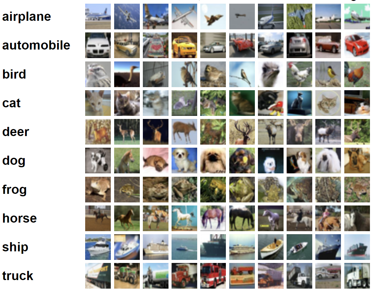 Figure 1: Sample images from the CIFAR-10 dataset

